


Kashmiri Pandit’s Cultural Association
Introduction:
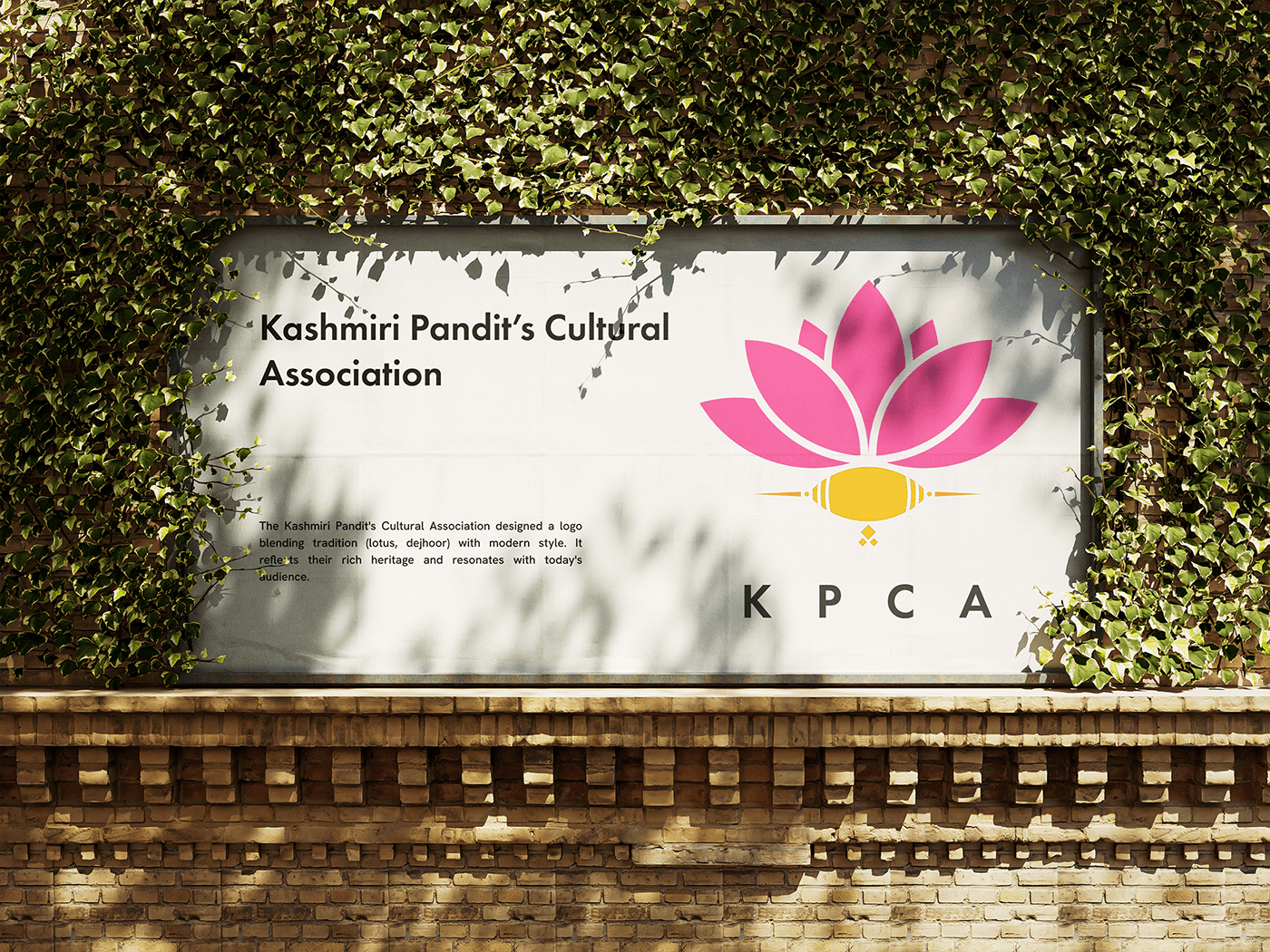
The Kashmiri Pandit’s Cultural Association sought to create a logo that encapsulated the essence of their heritage while resonating with modern sensibilities. The logo combines two significant traditional elements, the Lotus and the Dejhoor, renowned symbols in Kashmiri culture. Through careful design, the logo achieves a harmonious blend of tradition and modernity, embodying the rich cultural heritage of the Kashmiri Pandit community.

CONCEPTUALISATION
The logo utilises a minimalist approach by employing the intersections of concentric circles to represent the lotus and dejhoor. This geometric construction creates a clean and modern aesthetic, while retaining the cultural symbolism through its form.

Design Concept:
The primary concept behind the logo design was to fuse two iconic symbols - the Lotus and the Dejhoor - to represent the essence of the Kashmiri Pandit’s Cultural Association. The Lotus, symbolising purity and enlightenment, is intricately intertwined with the Dejhoor, a traditional Kashmiri ornament symbolising prosperity and auspiciousness. By juxtaposing these elements, the logo evokes a sense of cultural pride and continuity while embracing contemporary design principles.
The primary concept behind the logo design was to fuse two iconic symbols - the Lotus and the Dejhoor - to represent the essence of the Kashmiri Pandit’s Cultural Association. The Lotus, symbolising purity and enlightenment, is intricately intertwined with the Dejhoor, a traditional Kashmiri ornament symbolising prosperity and auspiciousness. By juxtaposing these elements, the logo evokes a sense of cultural pride and continuity while embracing contemporary design principles.


TYPOGRAPHY

Futura PT is a strong choice for logo featuring the Kashmiri Pandit Cultural Association because:
Modernity: Futura PT's clean, geometric lines echo the forward-looking spirit of the association while remaining culturally relevant.
Versatility: This typeface works well in various sizes, making it suitable for both print and digital applications of the logo.
Harmony: Futura PT's simplicity complements the traditional symbolism (lotus, dejhoor) in the logo, creating a balanced aesthetic that bridges the gap between past and present.


Conclusion
Background:
The Kashmiri Pandit Cultural Association (KPCA) sought a logo reflecting their heritage while appealing to modern audiences. Their rich cultural background features significant symbols like the lotus and the dejhoor. However, their existing visual identity lacked a cohesive style.
Process:
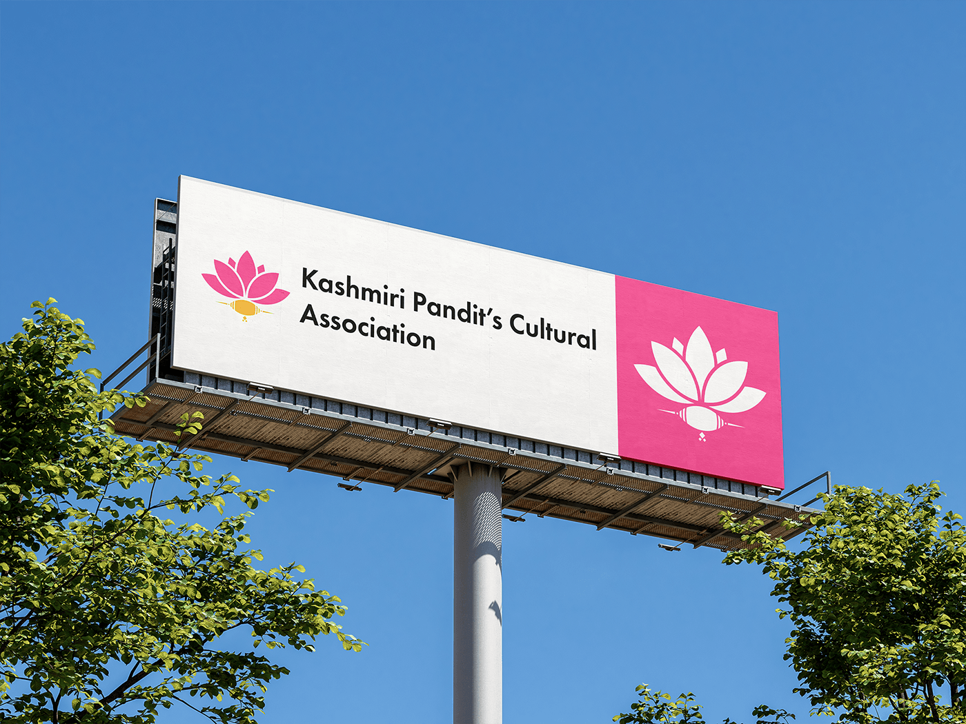
To bridge the gap, I designed a logo combining tradition and modernity. I explored incorporating the lotus and dejhoor in a contemporary aesthetic. Futura PT's clean lines provided a modern feel, while deep pink (referencing the lotus) added vibrancy. The tangerine/marigold shade (evoking saffron) complemented the warmth associated with Kashmiri culture. I meticulously balanced these elements to achieve a harmonious logo that resonates with both the KPCA's past and present.
Outcome:
The final KPCA logo successfully embodies their cultural heritage in a modern and visually appealing way. The lotus and dejhoor are seamlessly integrated, instantly recognisable to those familiar with Kashmiri symbolism. The color palette, with deep pink and tangerine/marigold, exudes warmth, energy, and creativity, aligning with the association's forward-looking spirit. Futura PT's clean typography ensures readability and versatility across various applications. The logo has been met with positive feedback, praised for its ability to bridge tradition and modernity, effectively representing the KPCA's identity.
~Token of Appreciation~
"I highly recommend Rahul for designing the KPCA community logo. He showed professionalism and delivered exceptional quality work that was worth the cost. He was responsive and engaged throughout the logo design process, demonstrating patience, passion, and an understanding of our community's needs. Rahul communicated consistently and effectively, resulting in a logo that aligned with our requirements. Despite facing challenges, he remained committed and his expertise resulted in a memorable logo for KPCA. Great job, Rahul! Keep up the exceptional work."
Thank you for Watching!


